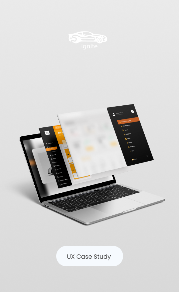
This project is a web dashboard designed for a car repair business to manage daily operations—tracking repair orders, job status, customer communication, and performance at a glance. The goal was to reduce operational chaos and help teams move faster with fewer mistakes, through a clean, action-driven interface.
The Problem
Car repair workflows are time-sensitive and detail-heavy. Most teams struggle with:
scattered information (customer, vehicle, parts, repair status)
unclear priorities (what’s urgent vs. what can wait)
manual reporting and inconsistent follow-up
This leads to delays, missed updates, and reduced customer trust.
My Role
Role: UX/UI Designer
Deliverables: UX research synthesis, IA, user flows, wireframes, high-fidelity UI, responsive layouts, UI kit
Tools: Figma
Target Users
Primary: Service advisors / workshop managers who handle orders and customer updates daily
Secondary: Technicians and business owners who need quick visibility into workload and revenue
The Goals
Provide a single source of truth for repair orders and job progress
Make daily tasks fast and repeatable (update status, assign, invoice, schedule)
Improve visibility with clear KPIs and alerts (overdue, pending approvals, parts delays)
Create a scalable UI system that supports more modules over time
Behind the scenes
UX Approach
Challenges
Large amount of data needs to stay readable and actionable
Different user roles require different priorities (manager vs. technician)
The interface must be fast to scan—not “pretty but slow”
Research & Key Insights
I reviewed similar dashboards and mapped common workshop workflows. The insights focused on speed and clarity:
Users need to know what’s urgent now (overdue jobs, pending approvals, delayed parts).
→ Designed a dashboard that surfaces priorities first.Users switch constantly between order details and status updates.
→ Built quick actions and clear navigation to reduce clicks.Operators need “confidence” that data is correct: status, totals, history.
→ Added structured cards, consistent tables, and clear states.
Information Architecture
The dashboard structure was built around real daily tasks:
Dashboard: performance snapshot + urgent queue
Repair Orders: list, filters, statuses, details
Customers & Vehicles: history, documents, notes
Invoices/Payments: billing, due amounts, payment status
Settings: staff roles and permissions
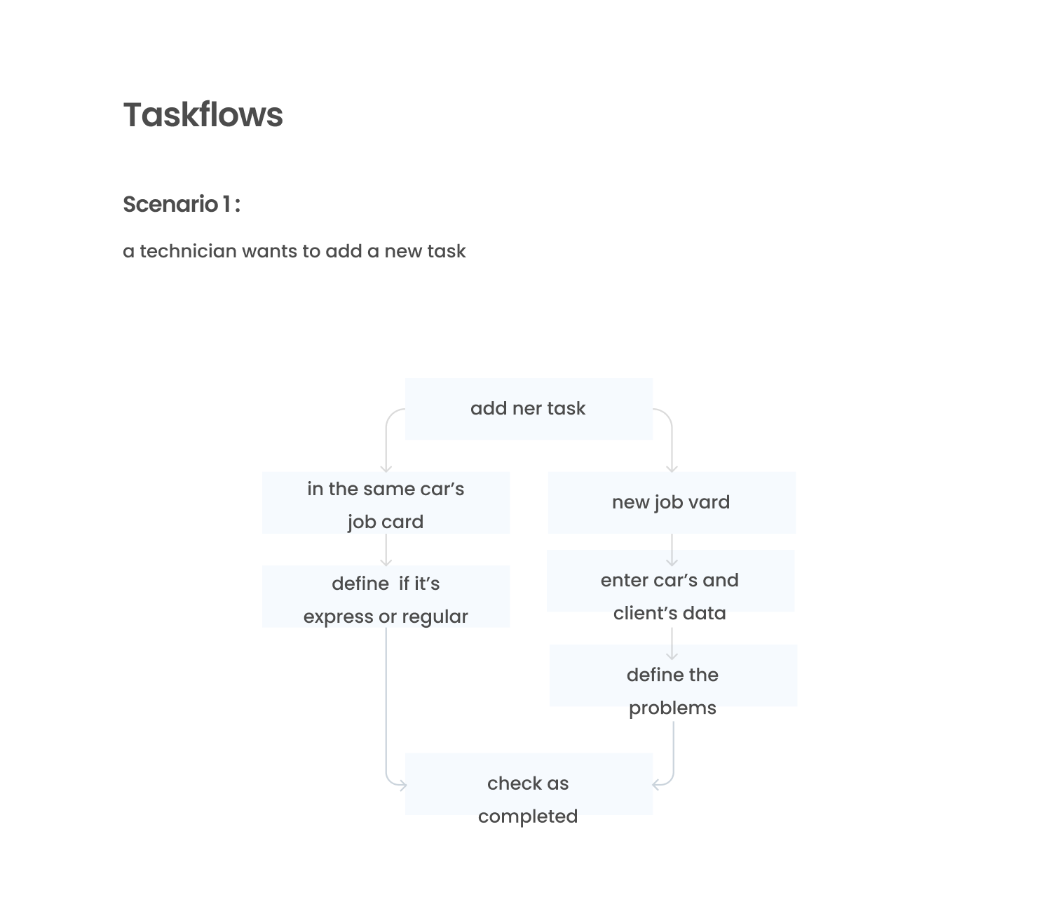
Core User Flow
Log in → Check urgent queue → Open repair order → Update status / assign tech / add parts → Generate invoice → Close job
This flow guided layout priority and component design.

UI Strategy
Design decisions
Design decisions
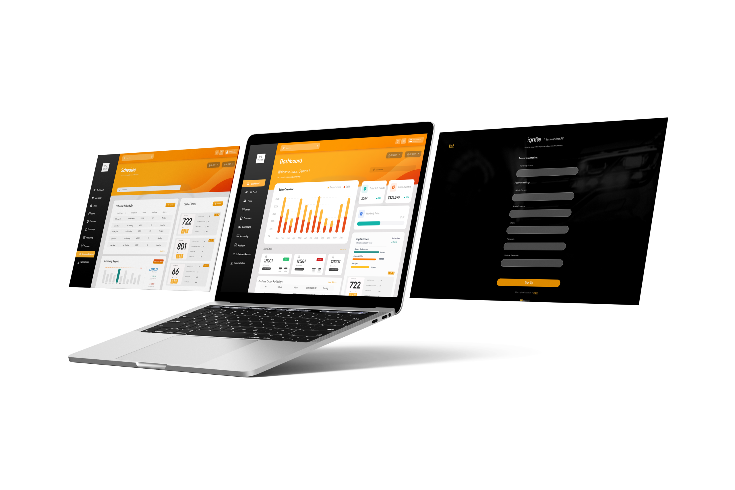
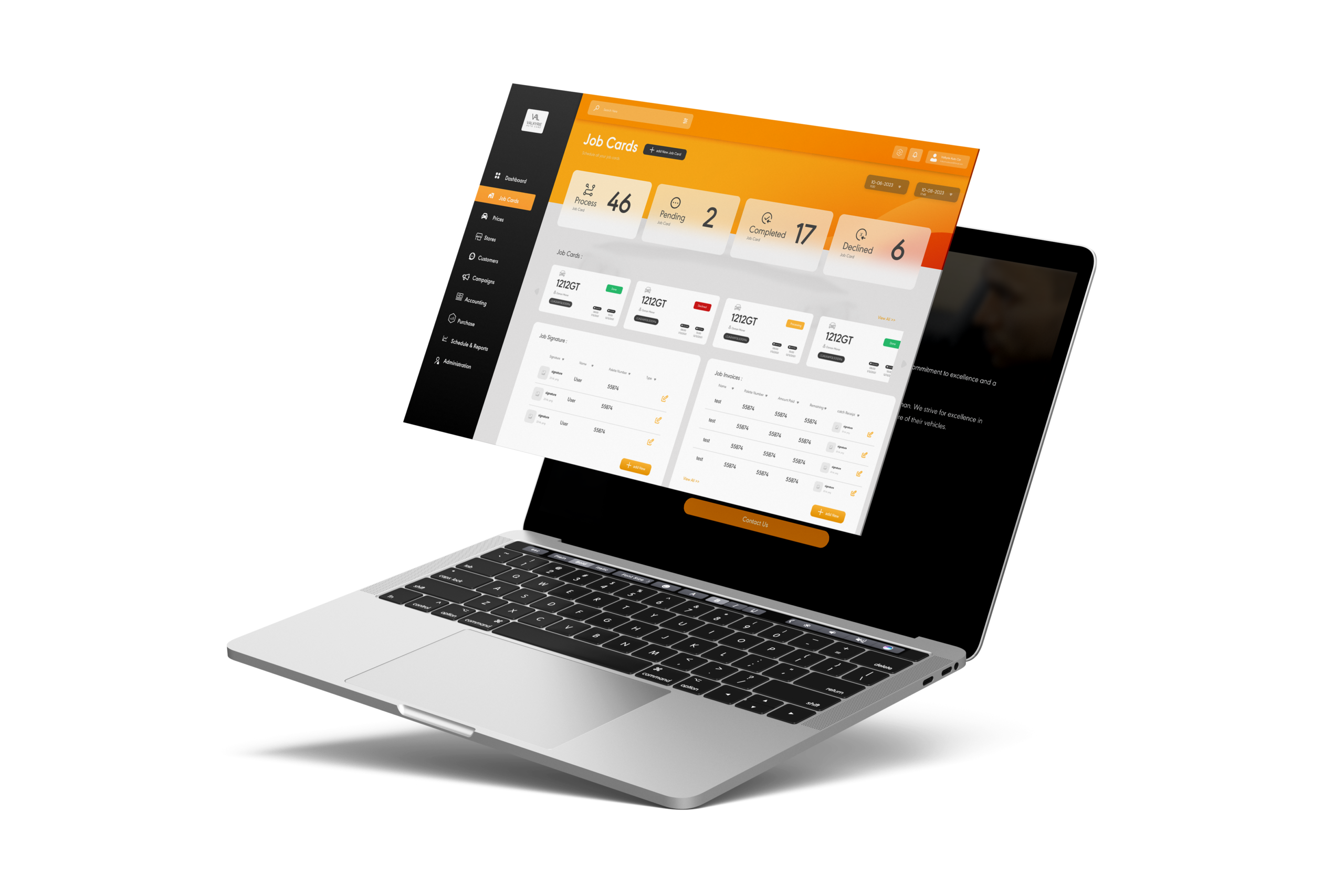
High contrast + orange accent to highlight actions, warnings, and KPI changes without visual noise
Left navigation to support fast module switching and predictable muscle memory
Card + table layout to separate “overview” from “details” and keep scanning effortless
Clear status system (labels + color + placement) so progress is visible in seconds
Style System
Consistent spacing rhythm and type hierarchy for readability
Repeatable components (cards, charts, tables, filters, forms) for scalability
Responsive layouts designed to keep core actions accessible
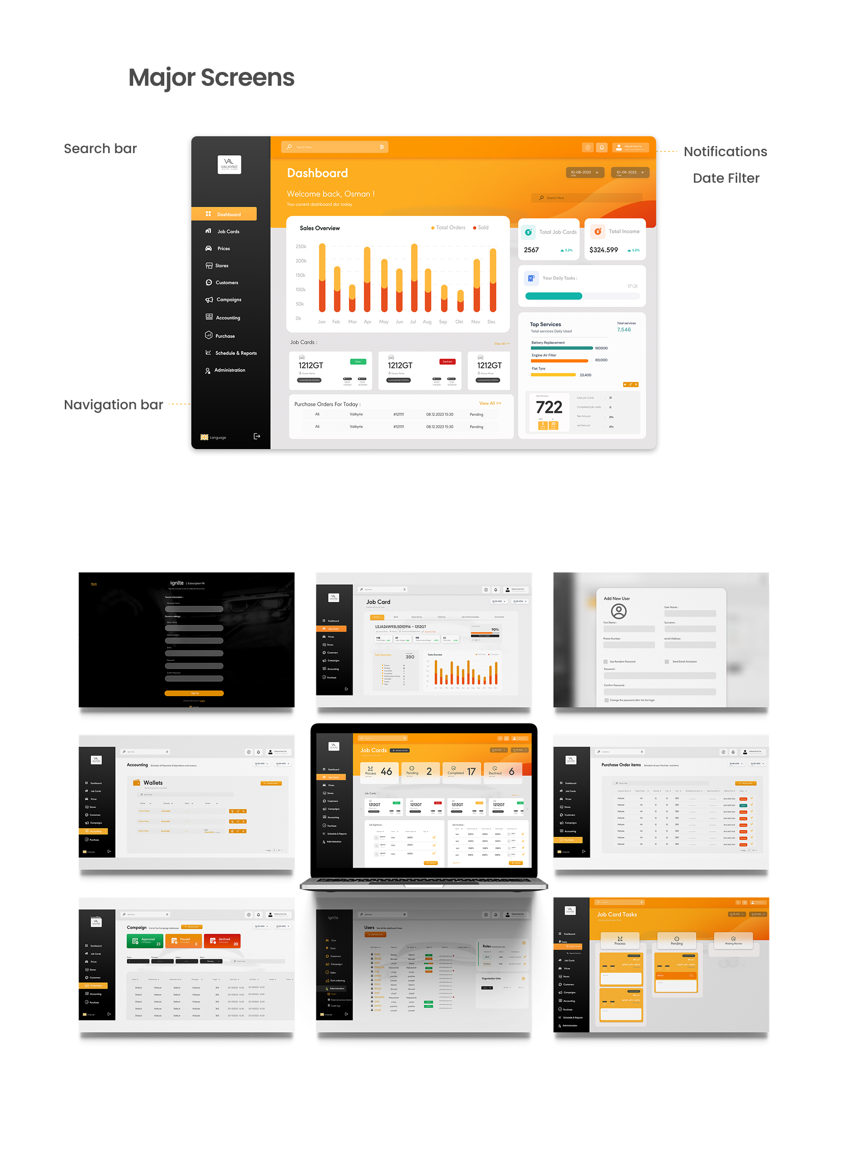
Final Screens (Highlights)
Dashboard overview: key KPIs, performance chart, and urgent jobs queue
Repair orders management: searchable list, filters, and status-driven workflow
Forms & details: structured content blocks to reduce errors and speed entry
Outcome
- Delivered a complete dashboard UI that supports operational visibility and daily task execution
- Created a scalable component system for future modules (inventory, supplier tracking, automated reminders)
- Built a clean, professional visual language aligned with fast-paced operational tools
Final Credits
Role: User Experience , User interface Design
Year: 2023
Client/Brand: Valkyrie Solutions