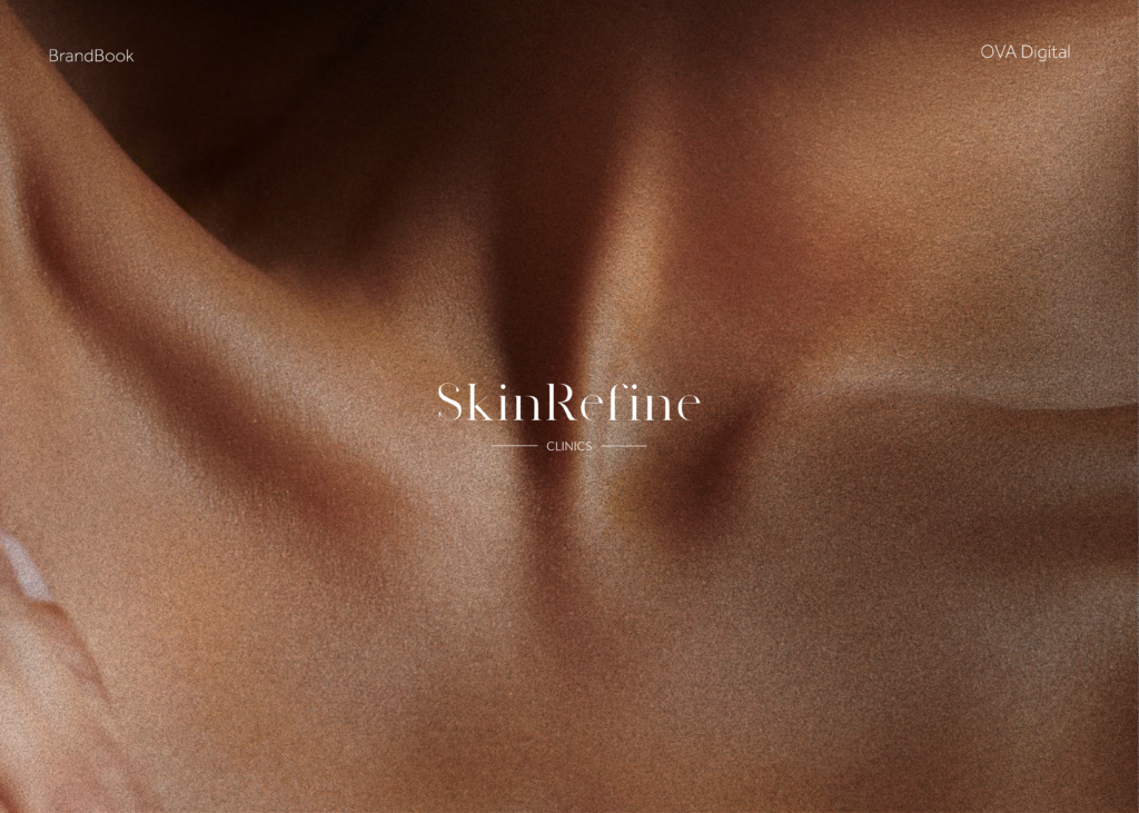
Skin Refine Clinics is a Dutch aesthetics clinic focused on skin improvement and non-surgical treatments—positioned around refinement, innovation, trust, and human care. I led the project end-to-end: creating the brand foundation and translating it into a modern website that communicates credibility, simplifies treatment discovery, and encourages consultation inquiries.
Goals
Build a brand identity that communicates elegance + clinical credibility
Design a website experience that feels clear, safe, and human
Organize treatments into a structured system (Skin Improvement / Fillers / Botox)
Create a scalable foundation for adding future treatments and content
Deliver a launch-ready responsive build with consistent UI execution
My Role
Branding • UX/UI Design • Website Development
Full ownership from concept to implementation and QA
Tools
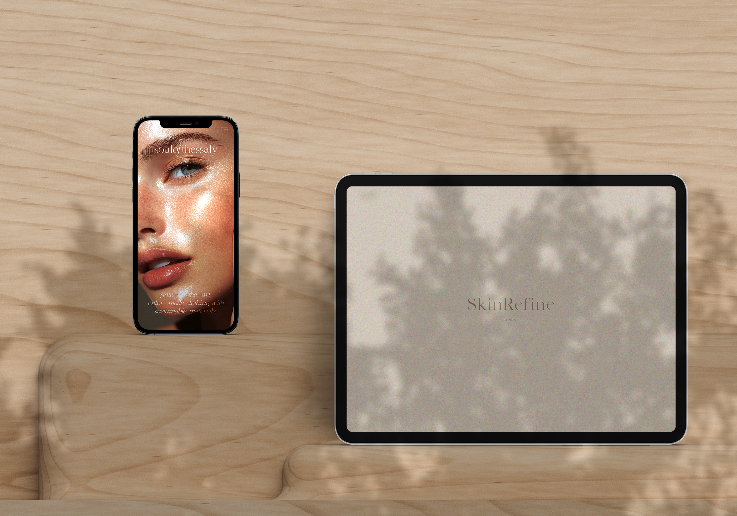
Figma (design + UI system) • WordPress • Adobe Photoshop
The Challenge
Aesthetic clinics face two consistent UX problems:
Trust friction: visitors need credibility and safety reassurance quickly.
Choice overload: multiple treatment types can feel overwhelming without structure.
The goal was to build a brand and website experience that feels premium and calm, while making it easy to explore treatments like skin improvement, fillers, and botox without confusion.
Behind the scenes
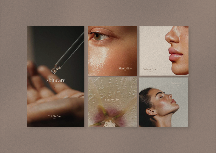
Branding & Concept
Brand Pillars (Strategy)
- The brand voice was built around four pillars:
- Refinement: a constant pursuit of elegance and perfection
- Innovation: advanced technologies and evidence-based practice
- Trust: ethical, safe, transparent treatments
- Care: personal attention with a human approach
Positioning Statement
“A treatment your skin deserves”—premium, calm, and results-focused without aggressive marketing.
Brand Tone
Minimalist • Elegant • Reliable • Thoughtful
The tone stays clear and reassuring—designed to reduce hesitation and increase confidence before booking.
UX & UI Strategy
Users & Intent
- Visitors comparing clinics and seeking reassurance (safety, ethics, professionalism)
- Users browsing treatments by need (skin improvement vs injectables)
- Mobile-first visitors looking for fast answers and an easy path to contact
Core Journey
Landing → Trust → Choose Category → Explore Treatment → Contact / Consultation
To support this journey, the interface emphasizes:
Strong hierarchy (headline → short explanation → CTA)
Clear navigation into treatment categories
Repeated contact prompts at natural decision points
Information Architecture
Treatments were structured to reduce cognitive load and help users self-select:
Huidverbeterende (skin-improving)
Filler behandelingen
Botox behandelingen
Key Pages
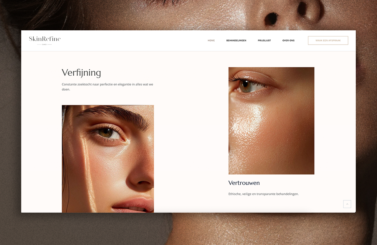
1. Homepage — Positioning + Trust
The homepage introduces the clinic through its values and immediately frames the experience as refined, evidence-based, and ethical—building confidence before users explore treatments
2. Treatments Hub — Fast Discovery
Treatment categories are presented clearly so users can choose a direction quickly (skin improvement, fillers, botox) without reading long blocks of text.
3. Treatment Pages — Clarity & Decision Support
Dedicated pages provide the structure needed for informed decisions and future SEO growth (each new service can follow the same template).
4. Contact — Confidence & Accessibility
Contact details are clear and visible, including the clinic address in Utrecht and direct communication channels.
Development & Implementation
I built the website with a system-based approach so design intent stays consistent in production:
Consistent spacing rhythm and typography hierarchy
Reusable section modules (value blocks, treatment cards, CTAs)
Responsive QA to ensure clarity and readability across devices
Final Credits
Role: UX/UI, Development
Year: 2025
Client/Brand: Skin Refine Clnics

