BRO’S is a premium, minimalist brand built for modern advertising and creative production—where bold presence meets calm clarity. I designed the identity and translated it into a conversion-focused website that showcases services, featured work, and thought leadership, with a distinctive black-and-accent visual language.
Goals
Create a distinct brand identity grounded in a strong concept
Build a high-impact homepage that communicates value fast
Structure services into a clean, scannable system (without overwhelming users)
Highlight projects and articles to build social proof + authority
Deliver a responsive, launch-ready website with consistent UI and strong hierarchy
My Role
Branding • UX/UI Design • Website Development
End-to-end ownership: concept → identity → interface → build.
Tools
Figma (design + UI system) • WordPress • Adobe Illustrator
The Challenge
BRO’S needed a digital presence that could do three things at once: Establish credibility and premium positioning from the first impression and Communicate multiple offerings without feeling cluttered thenDrive high-intent inquiries through a clear, confident CTA structure
Behind the scenes
Branding & Concept Creation
Core Idea
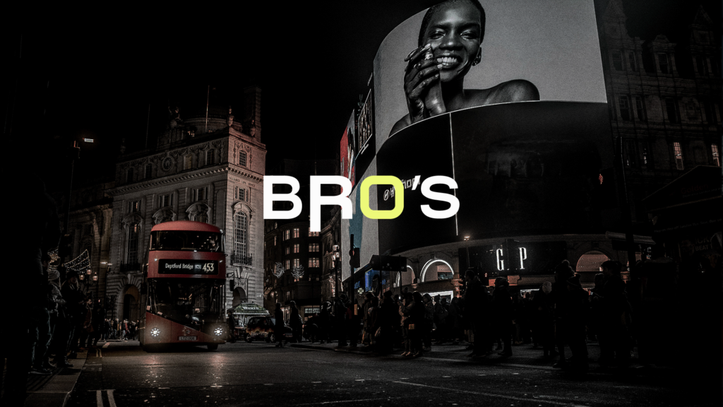
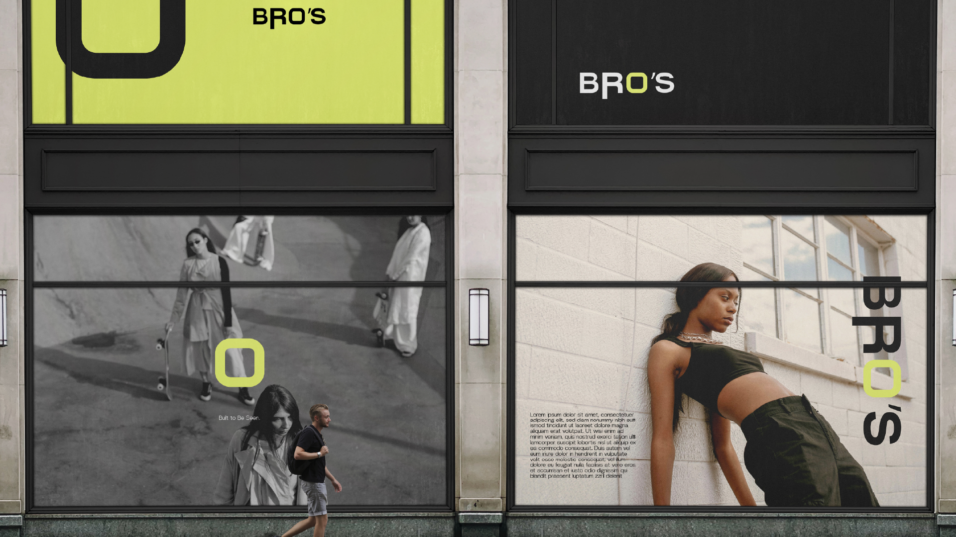
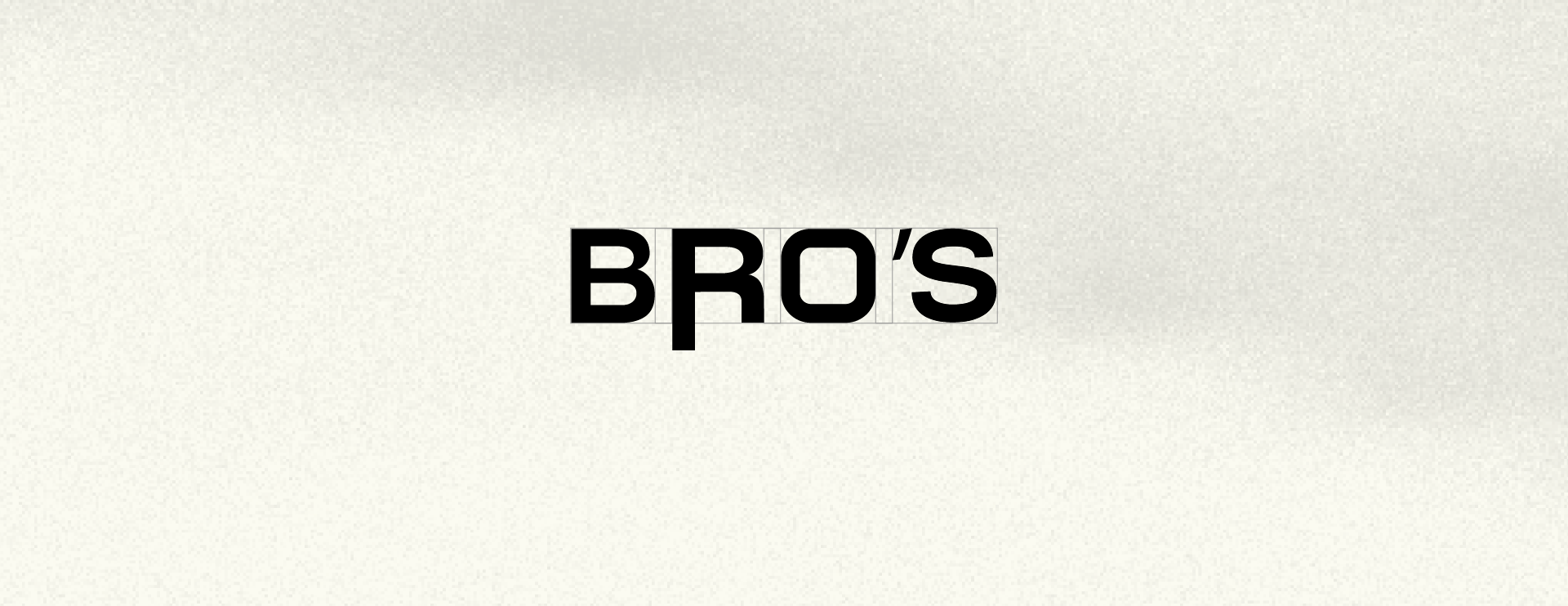
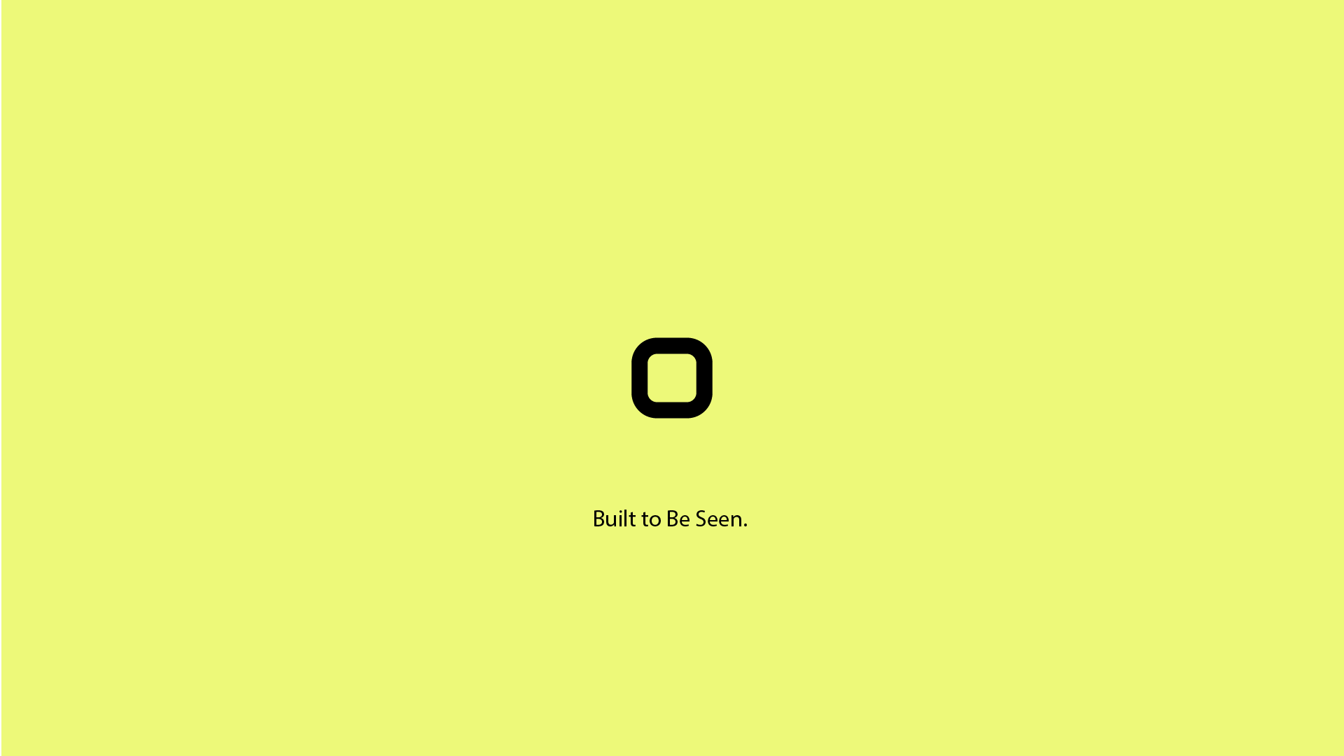
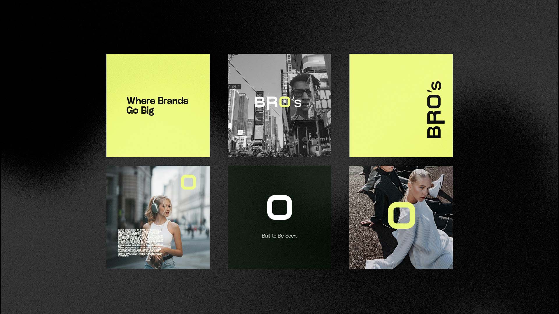
The identity was built around a single metaphor: the physical billboard frame—the structure that holds an ad in place. That translated into typography that feels boxed-in, controlled, and intentionally bold, with subtle “open edges/corners” that hint at a built-in frame within the wordmark.
Strategic Identity
Purpose: Reframe how brands showcase presence in a visually crowded world
Target Audience: Luxury, real estate, health & beauty, architecture, premium services
Differentiator: Static elegance + clarity paired with physical presence
Mission: Give brands a timeless frame—where attention meets calm
Vision: Advertising that’s artful, not noisy
Brand Personality
Minimalist • Elegant • Reliable • Thoughtful
Tone: Calm, clear, elevated
Behavior: Focused, sleek, detail-oriented
Visual Language
The system uses a high-contrast foundation (deep black + refined neutrals) with a bold accent to create a “dominant clarity” effect—premium, modern, and unmistakable.
UX & UI Strategy
Information Architecture
The homepage was designed as a guided narrative:
Hero → immediate positioning + CTA
Value statement → what BRO’S delivers
Services → structured options with scannable modules
Proof → latest projects (portfolio grid)
Authority → latest thoughts (content)
Final CTA → clear invitation to work together
Design Principles
Clarity over decoration: minimal copy + strong hierarchy
Premium rhythm: large spacing, strong typography, confident contrast
Scannability: section headers + short blocks + visual anchors
Conversion-first: CTAs placed where intent peaks, not only at the end
Consistency: a reusable system that keeps every section cohesive
Key Screens (Homepage Breakdown)
1. Hero Section — First Impression
“Creative team for future’s brands.”
A bold headline with a high-contrast accent establishes positioning instantly. The CTA is clearly visible to convert high-intent visitors quickly.
Why it works:
Strong headline hierarchy
Immediate “brand vibe” through visuals + spacing
One primary action (work inquiry) without distractions
2. Value Proposition
A short, confident statement that frames BRO’S as a solution-driven partner—not just a studio.
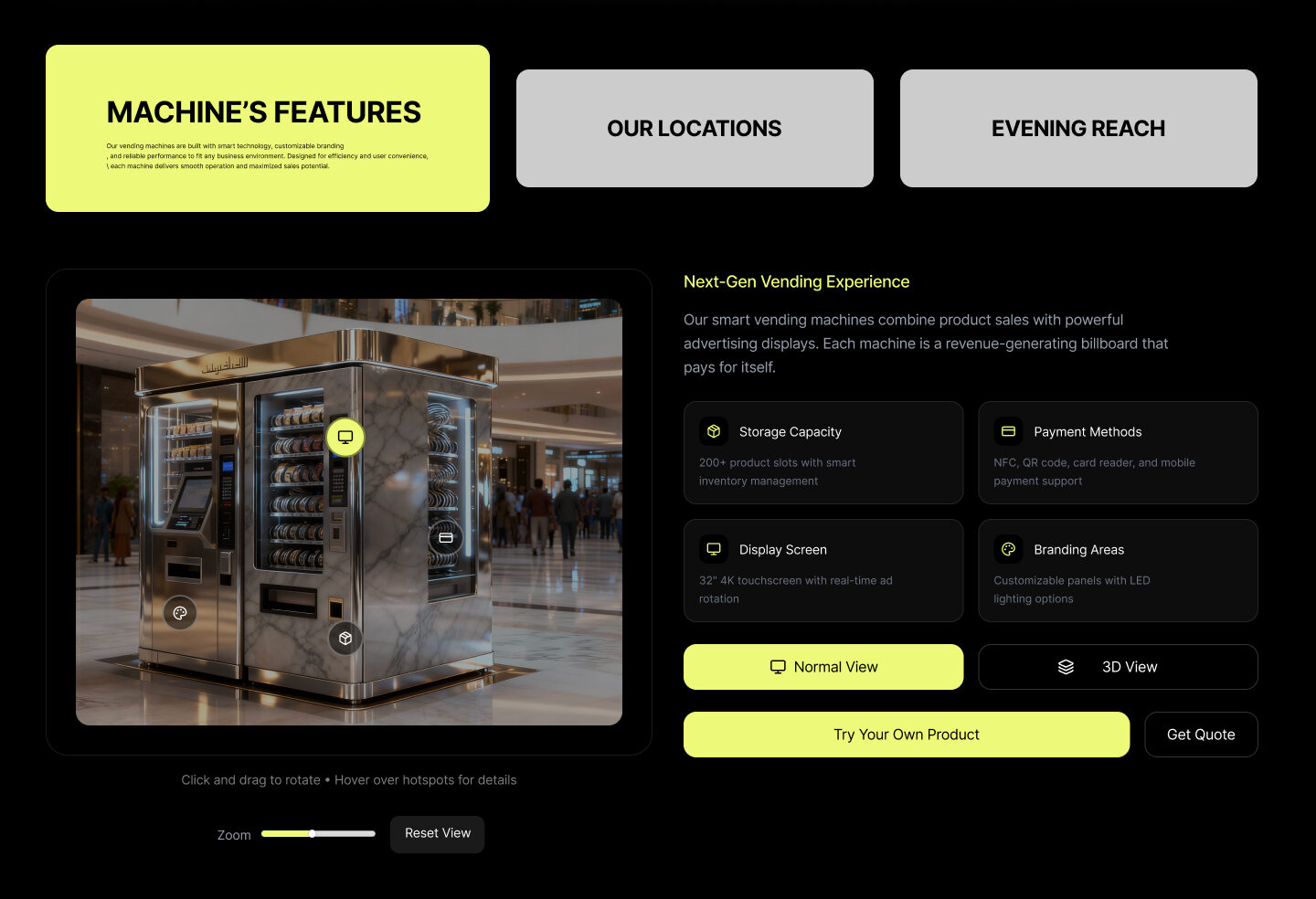
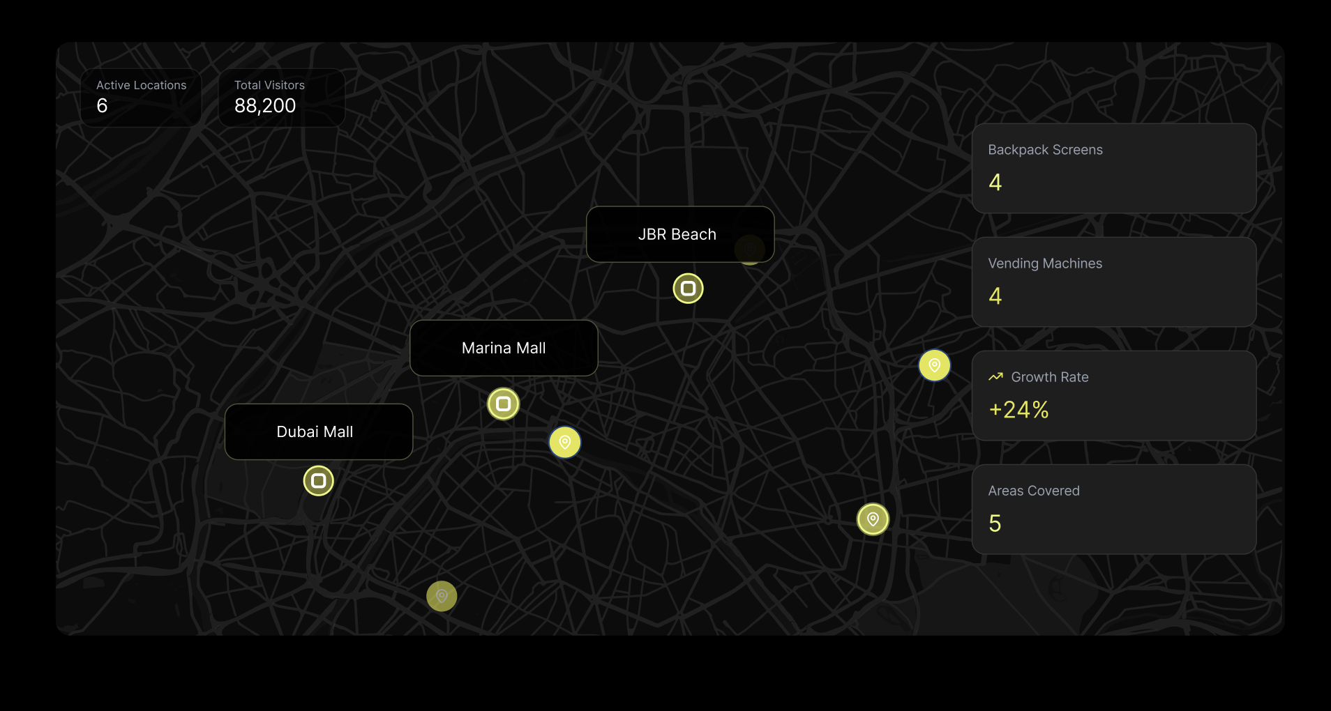
3. Services — Modular & Scannable
Services are presented as clear modules (e.g., features, locations, reach) rather than long paragraphs. This supports fast scanning and reduces cognitive load.
Why it works:
Users can jump into what matters most
The interface feels structured (matching the “frame” concept)
Keeps complexity organized without feeling busy
Responsive & Build Notes
Designed with a system-based layout to maintain consistency across sections
Emphasis on typography scaling, spacing rhythm, and legibility on smaller screens
Final QA focused on:
alignment and section consistency
button states and interactive clarity
image quality and contrast
CTA visibility across scroll depth
Final Credits
Role: Branding, UX/UI, Development
Year: 2025
Client/Brand: BRO’S Co.